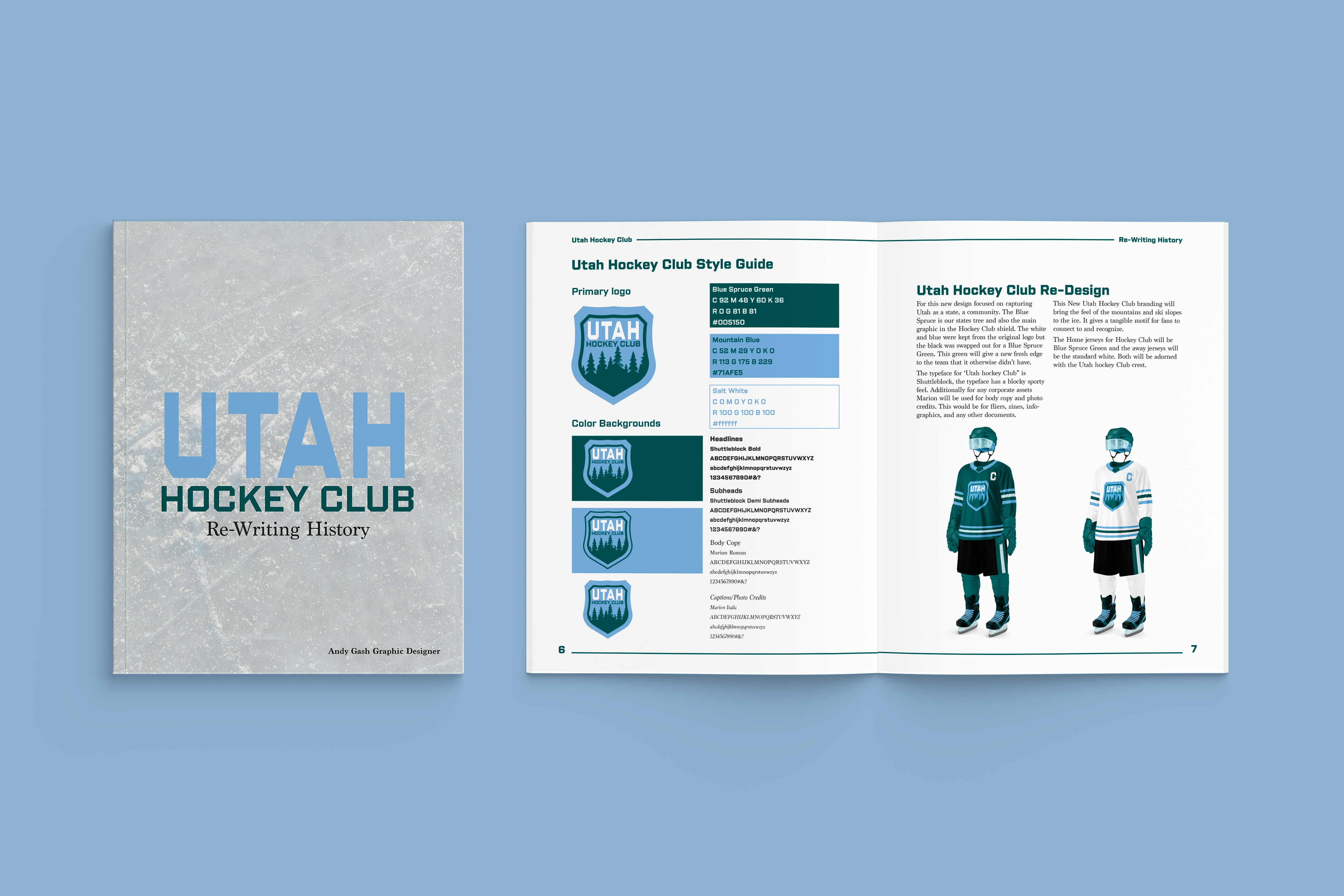
Utah Hockey Club Unofficial Re-Brand
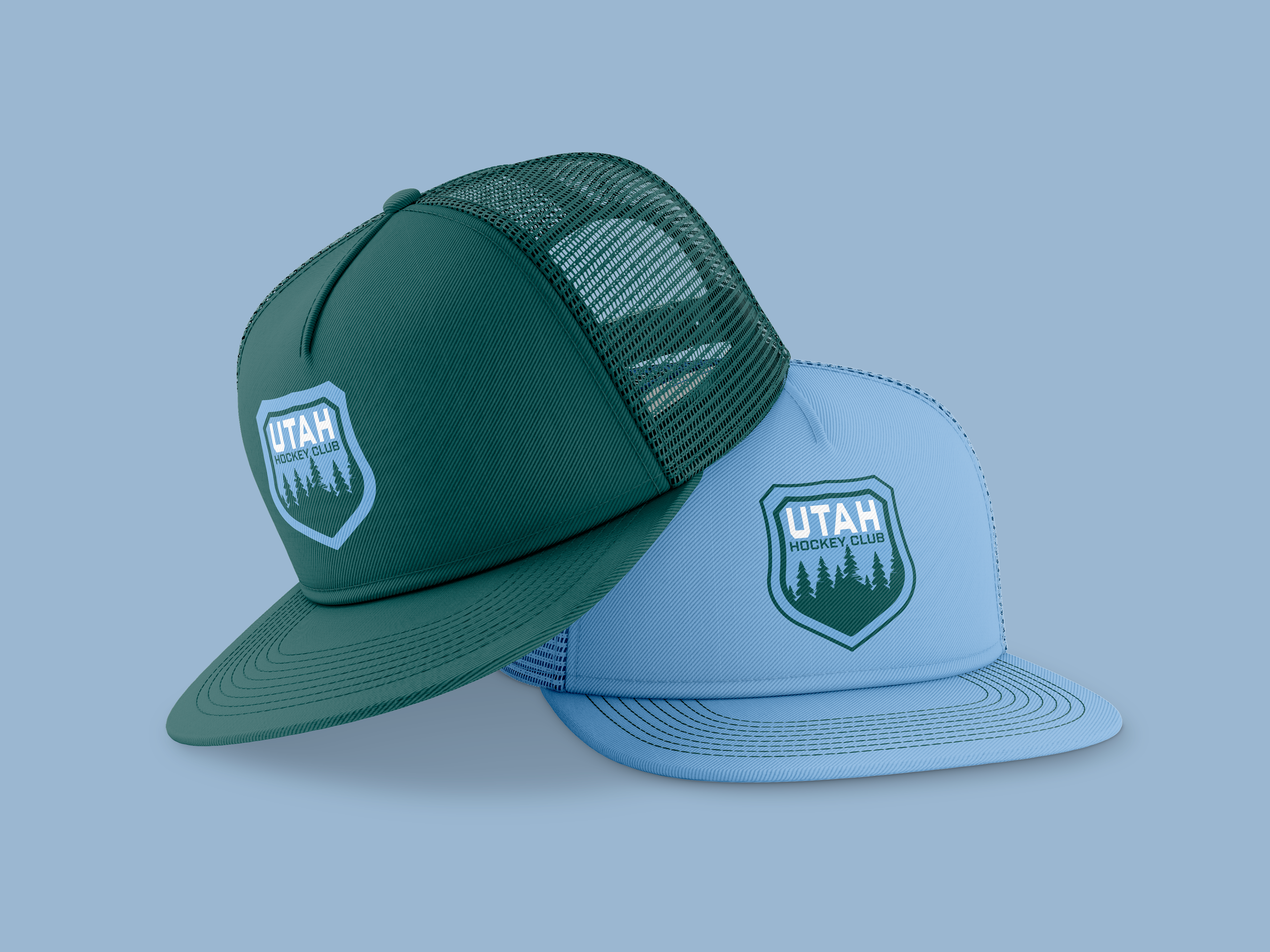
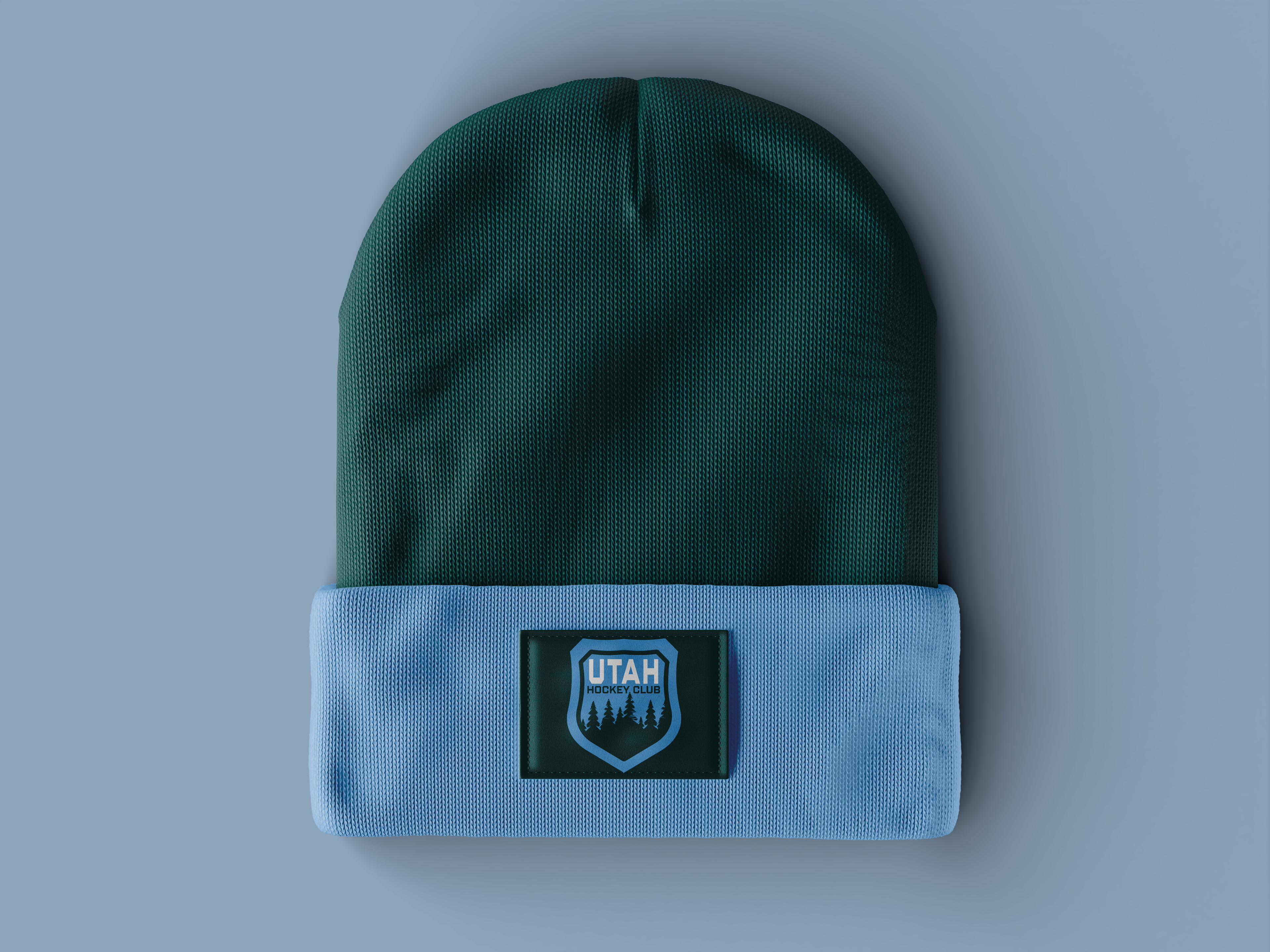
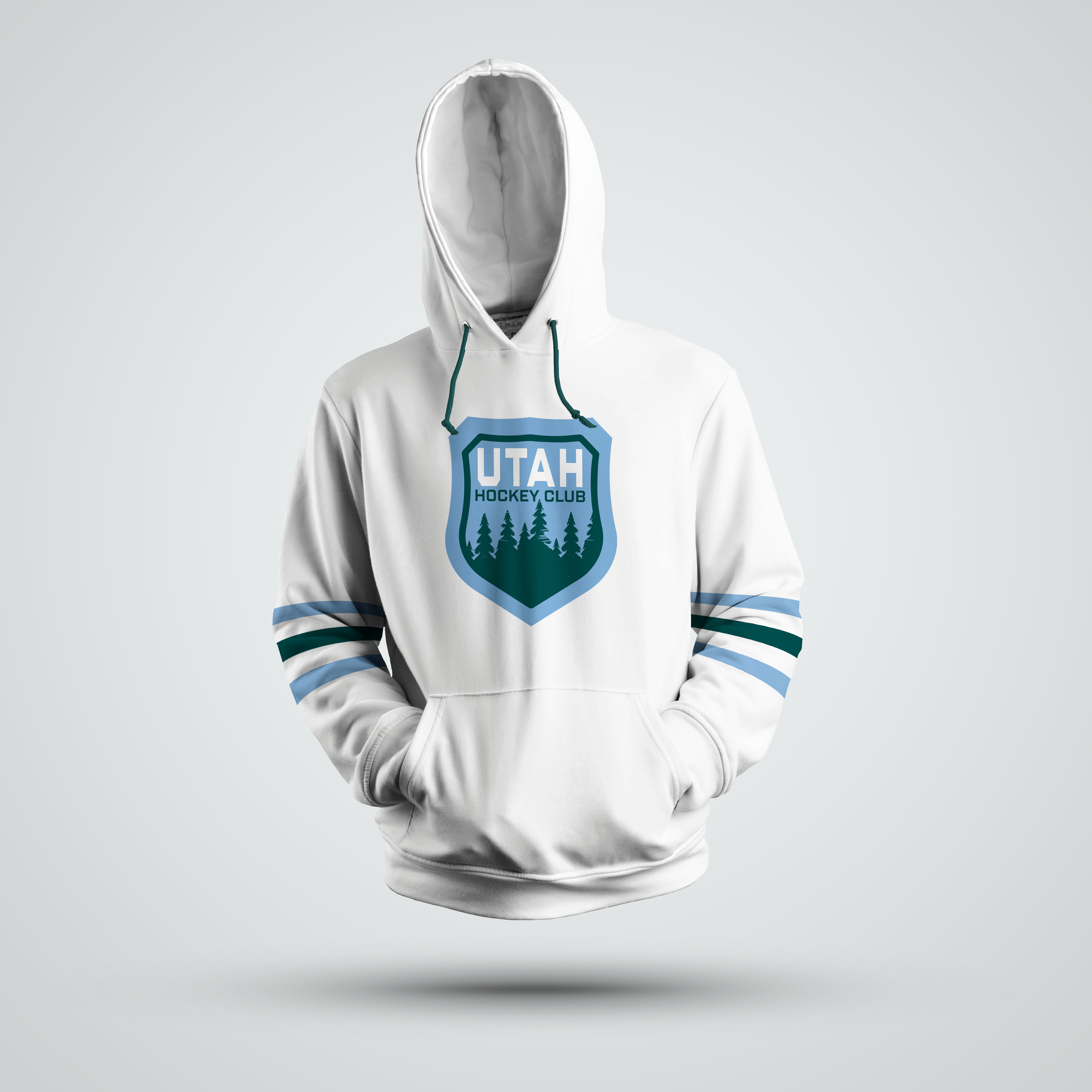
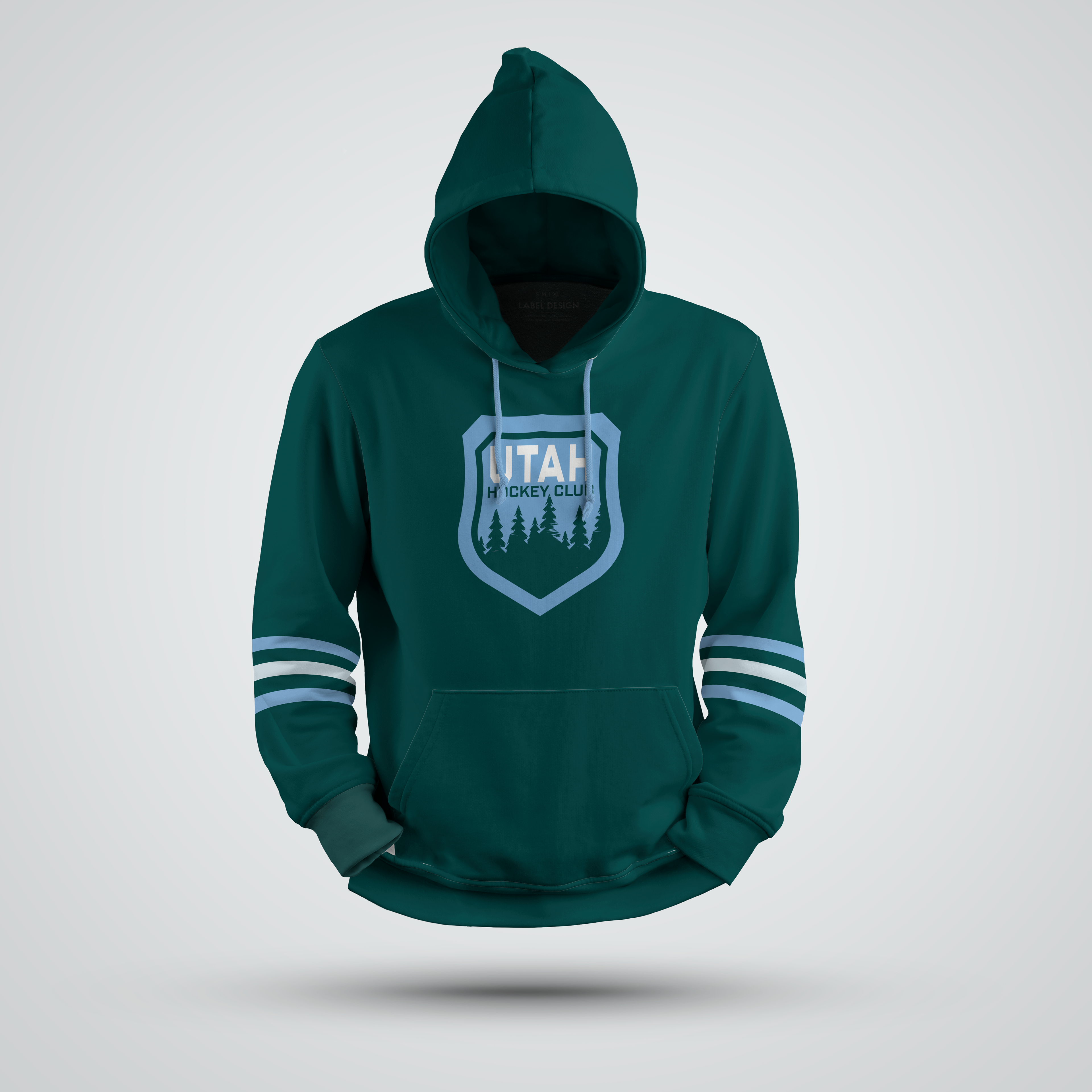
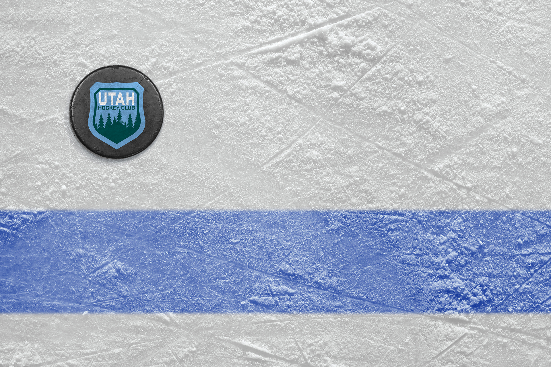
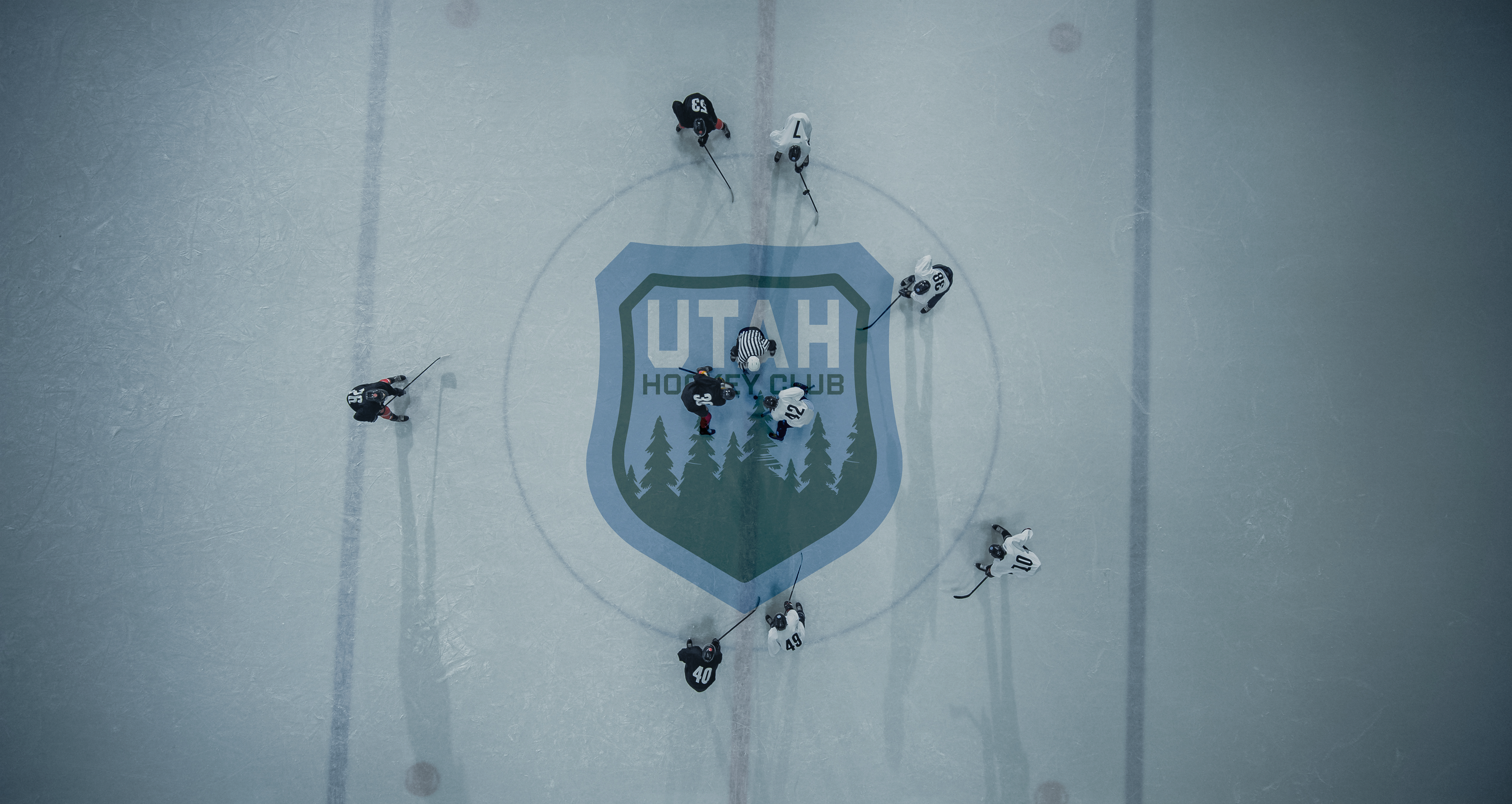
Utah Hockey Club had 5 logos for their first season so this inspired me to redesign the Hockey club logo to have a cohesive well-rounded branding. I took inspiration from the natural beauty of Utah. The color I added, Blue Spruce Green, pays homage to the state tree of Utah.
The colors keep a high contrast of the original, but the replacement of black for green gives a colorful and fresh feel to the NHL team. The blue-green will also stand out in the NHL whereas the black has other teams like LA kings and Boston Bruins.
My goal with this re-brand was to give Hockey Club the same kind of home city/state care and symbolism that the other 31 teams in the NHL have. Many teams in the NHL have one or more links between them and their location. With Hockey Club it felt very distant from Utah. My logo pulls it back into the feel of our mountainous state.
Disclaimer: Utah Hockey Club is not owned by me nor am I affiliated with them.